ax3
ax3
Manzanita K.K. is a Japanese company made up of neuroscientists with a passion for revolutionizing the marketing industry.
From January 2023 - April 2023, I was a web design intern while I studied abroad in Tokyo, Japan.
My task while there was to design a prototype, from the ground up, of ax3, a product to be used by businesses to determine their target customers and develop advertising campaigns that resonate with such audience(s).
Goal
Design and prototype ax3
Goal
Design and prototype ax3
Tool(s)
Figma, Illustrator, Photoshop
Tool(s)
Figma, Illustrator, Photoshop
Timeline
4 months
Timeline
4 months
01
01
Understanding the Users
Understanding the Users
Who are ax3 users?
Global businesses, with focus on those in Japan
Who are ax3 users?
Global businesses, with focus on those in Japan
What is the goal of ax3 users?
To learn who their core customers are so they may target their ad campaigns towards them
What is the goal of ax3 users?
To learn who their core customers are so they may target their ad campaigns towards them
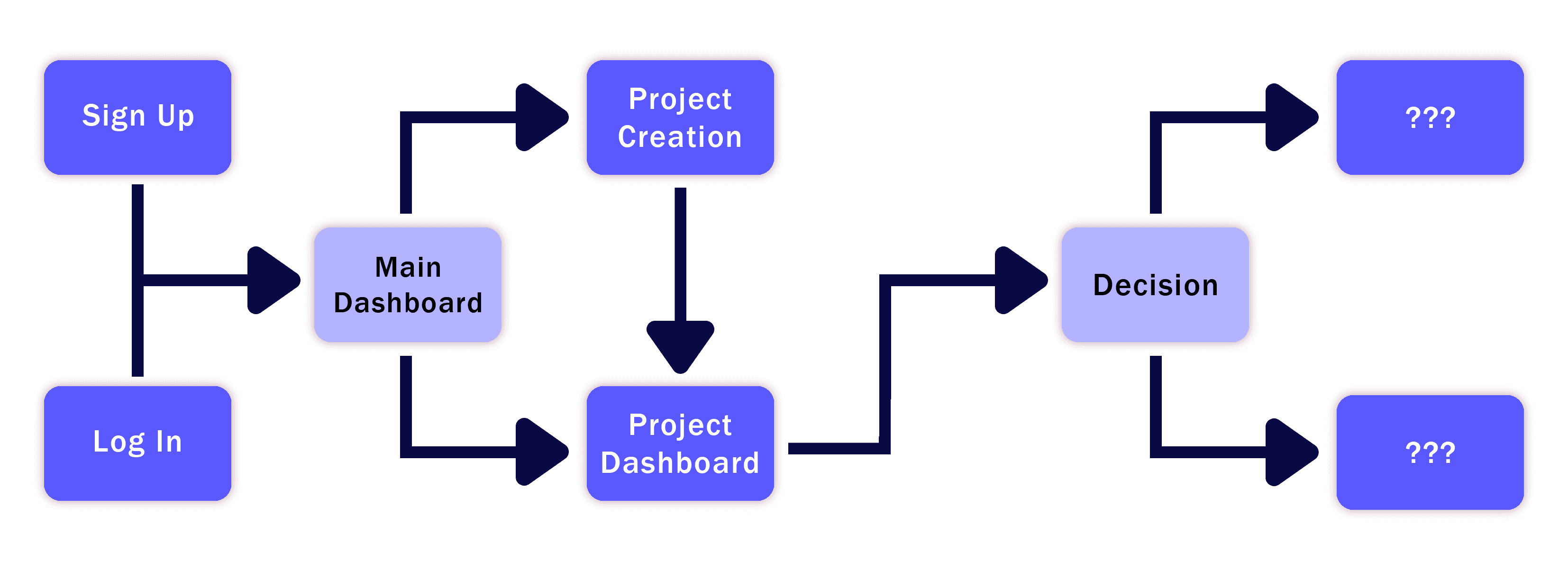
How can we get them there?
Direct the user down pathways depending upon the information they have on their audience and how they choose to analyze the data ax3 collects
How can we get them there?
Direct the user down pathways depending upon the information they have on their audience and how they choose to analyze the data ax3 collects
User Flow Chart
User Flow Chart
02
02
Understanding the Design
Understanding the Design
My employer emphasized repeatedly that he wanted ax3's design to align with universal design methodology-mirroring the globally-recognized and sleek UX of companies such as Google and its open source design systems (Material 3).
My employer emphasized repeatedly that he wanted ax3's design to align with universal design methodology-mirroring the globally-recognized and sleek UX of companies such as Google and its open source design systems (Material 3).


03
03
Main Dashboard
Main Dashboard
"Projects" in ax3 are advertising campaigns a company is running and belong on ax3's main dashboard. This dashboard would determine the style for the rest of the product as the first interface I created!
"Projects" in ax3 are advertising campaigns a company is running and belong on ax3's main dashboard. This dashboard would determine the style for the rest of the product as the first interface I created!
Base Elements
Base Elements
Dashboard
How the ax3 processes being done on the user's projects have progressed
Dashboard
How the ax3 processes being done on the user's projects have progressed
Recent Projects
A user's ad campaigns
Recent Projects
A user's ad campaigns
Recent Activities
Recent activities of the users' coworkers on the same projects
Recent Activities
Recent activities of the users' coworkers on the same projects
Mock-Ups
Mock-Ups

Professional & Lively
Professional & Lively

Corporate
Corporate

Experimental
Experimental

Creativity & Maturity
Creativity & Maturity
The Final Main Dashboard
The Final Main Dashboard
Based on my research of universal design and feedback from my coworkers, I combined the various elements of my mock-ups to create a final dashboard with distinct widgets and angular designs.
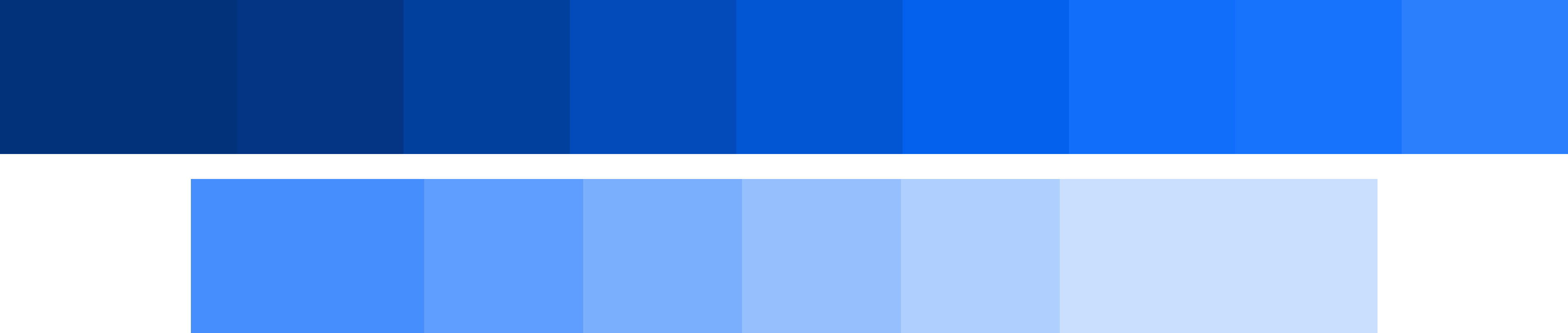
I decided upon a BLUE color scheme to give ax3 a professional, intellectual, and lively look that could be understood universally.
Based on my research of universal design and feedback from my coworkers, I combined the various elements of my mock-ups to create a final dashboard with distinct widgets and angular designs.
I decided upon a iBLUE color scheme to give ax3 a professional, intellectual, and lively look that could be understood universally.

04
04
New Project
New Project
The New Project Page had to include the user inputting: name, industry, budget, keywords associated with the project, etc. as they would be necessary to ax3's processes.
I was tasked with creating a high-fidelity wireframe for what a user would see when creating a new project, a new advertising campaign, for their company. My supervisor at Manzanita K.K. had certain pieces of information he wanted the user to input when creating a new project, such as a name, industry, budget, keywords associated with the project, etc. as they would be necessary to the processes ax3 would do on it.

05
05
Project Dashboard
Project Dashboard
The Project Dashboard Page that a user would see when they select their project from the main dashboard, including project details and a percentage circle visually showing the user the progress of ax3's analyses.
I also created a high-fidelity wireframe for a dashboard that the user would see when they select their project, including the details given when the project was created and and percentage circle representing the progress of ax3's analyses being done on the project.

06
06
Choices
Choices
This page showcases choices users can make about their advertising campaign that will affect ax3 processes. It also has a button to show the recommended choices, while also allowing the user the ability to choose their own and save them. A table was also put underneath these choices to showcase pertinent information to a user.
This page showcases choices users can make about their advertising campaign that will affect ax3 processes. It also has a button to show the recommended choices, while also allowing the user the ability to choose their own and save them. A table was also put underneath these choices to showcase pertinent information to a user.
In line with universal design, I diligently designed the choice cards to ensure they would be understandable, straightforward, and distinct with unique designs, iconography, etc.
In line with universal design, I diligently designed the choice cards to ensure they would be understandable, straightforward, and distinct with unique designs, iconography, etc.
07
07
Sign-Up & Log-In
Sign-Up
&
Log-In
I decided a two-column layout would best suit the sign-up and log-in pages of the site, to display the ax3 branding and the user input needed to sign up or log in to the site succinctly.
I decided a two-column layout would best suit the sign-up and log-in pages of the site, to show the ax3 branding and the user input needed to sign up or log in to the site succinctly.

I designed the ax3 logo to be simple, while alluding to the "intelligent" marketing purpose of the website, making the 3 appear like an exponent.
I then brainstormed a short, yet memorable tagline to go with the logo, deciding upon: "Time to find your audience, so they can find you".
I designed the logo for ax3 to be simple, while alluding to the "intelligent" marketing purpose of the website, making the 3 look like an exponent.
I then brainstormed a short, yet memorable tagline to go with the logo, deciding upon: "Time to find your audience, so they can find you".

I included thick lines diagonally leading to the tagline and therefore the logo, placing the user's focus on both of these.
In addition, I designed the logo side for the log-in and sign-up pages to be color inverts of one another, demonstrating their different functions.
In terms of layout, I included thick lines diagonally leading to the tagline and therefore the logo, placing the user's focus on both of these things as their eyes are naturally drawn to them.
In addition, I designed the side with ax3's logo for the log-in and sign-up pages to be color inverts of one another, showing that they are different pages with completely different functions.
08
08
Side Menus
Side Menus
The team at Manzanita K.K. was experimenting with the idea of making the side menu collapsible as seen in many of my previous designs, so I made some prototypes.
The team at Manzanita K.K. was experimenting with the idea of making the side menu collapsible as seen in many of my previous designs, so I made some prototypes.
I experimented with what the side menu would look like if it was collapsible and vice versa. I also experimented with the UI for collapsing and opening the menu.
I experimented with what the side menu would look like if it was collapsible and vice versa. I also experimented with the UI for collapsing and opening the menu.
09
09
Error 404
Error 404
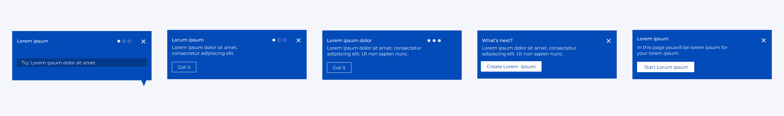
Creating ax3's Error 404 Page was a challenge as I was not familiar with how these pages were typically designed.
So I did my research and found that typical Error 404 pages include...
Creating ax3's Error 404 Page was a challenge as I was not familiar with how these pages were typically designed.
So I did my research and found that typical Error 404 pages include...
A character demonstrating the "broken" or "lost" nature of the page they are looking for
A character demonstrating the "broken" or "lost" nature of the page they are looking for
An explanation of the error the website is having, and an apology for it
An explanation of the error the website is having, and an apology for it
Interjections as a heading or subheading (Examples: oops, whoops, shoot, yikes, oh no, etc.)
Interjections as a heading or subheading (Examples: oops, whoops, shoot, yikes, oh no, etc.)
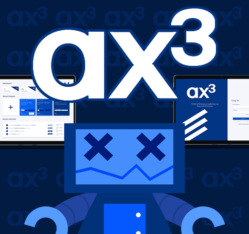
So, I created a broken robot design in the ax3 color scheme to be the mascot for the page and came with some whimsical verbiage to put onto the page.
I chose a robot to be in line with ax3's processes which are ingrained in analyses and calculations, as well as look into the future of what technology can do.
So, I created a broken robot design in the ax3 color scheme to be the mascot for the page and came with some whimsical verbiage to put onto the page.

I chose a robot to be in line with ax3's processes which are ingrained in analyses and calculations, as well as look into the future of what technology can do.
10
10
Settings
Settings
I studied the typical "Settings" pages of websites, and created wireframes with the elements I found common within them, such as the option to change one's password, the ability to change profile picture, etc.
I also included other details such as a place for a user to input their position in the company they work at which would be pertinent for users of ax3 to know about their fellow project editors.
After studying typical "Settings" pages of websites, I created these wireframes with the elements I found common within them, such as the option to change one's password, the ability to select a profile picture, etc.
I also included other details as prompted to by my supervisor, such as a place for a user to input their position in the company they work at.
I made two high-fidelity wireframes respectively for the "Edit Profile", "Privacy & Security", and "Preferences" subpages in the settings page to A/B test them with my coworkers.
I made two high-fidelity wireframes respectively for the "Edit Profile", "Privacy & Security", and "Preferences" subpages in the settings page to A/B test them with my coworkers.
Edit Profile
Edit Profile


Privacy and Security
Privacy and Security


Preferences
Preferences


11
11
Manzanita K.K. Internship Page
Manzanita K.K.
Internship Page
Outside of ax3, I designed the internship page for the Manzanita K.K. website. I was told that this page would showcase past interns and function as a way to encourage future people to apply to be interns at Manzanita K.K.
When designing my high-fidelity wireframes, I focused on:
Outside of ax3, I designed the internship page for the Manzanita K.K. website. I was told that this page would showcase past interns and function as a way to encourage future people to apply to be interns at Manzanita K.K.
Considering that Manzanita K.K. had recently asked me for my major and a blurb on my time at the company, I knew what information was to be included about each intern on the page.
When designing my high-fidelity wireframes, I focused on:
Emphasizing each intern's story in their own container/space
Emphasizing each intern's story in their own container/space
Highlighting recruiting more people to join the company
Highlighting recruiting more people to join the company
Making the design sleek and elegant, as well as intuitive
Making the design sleek and elegant, as well as intuitive
These two designs were combined to create the final version (as of March 2025)!
These two designs were combined to create the final version (as of March 2025)!
12
12
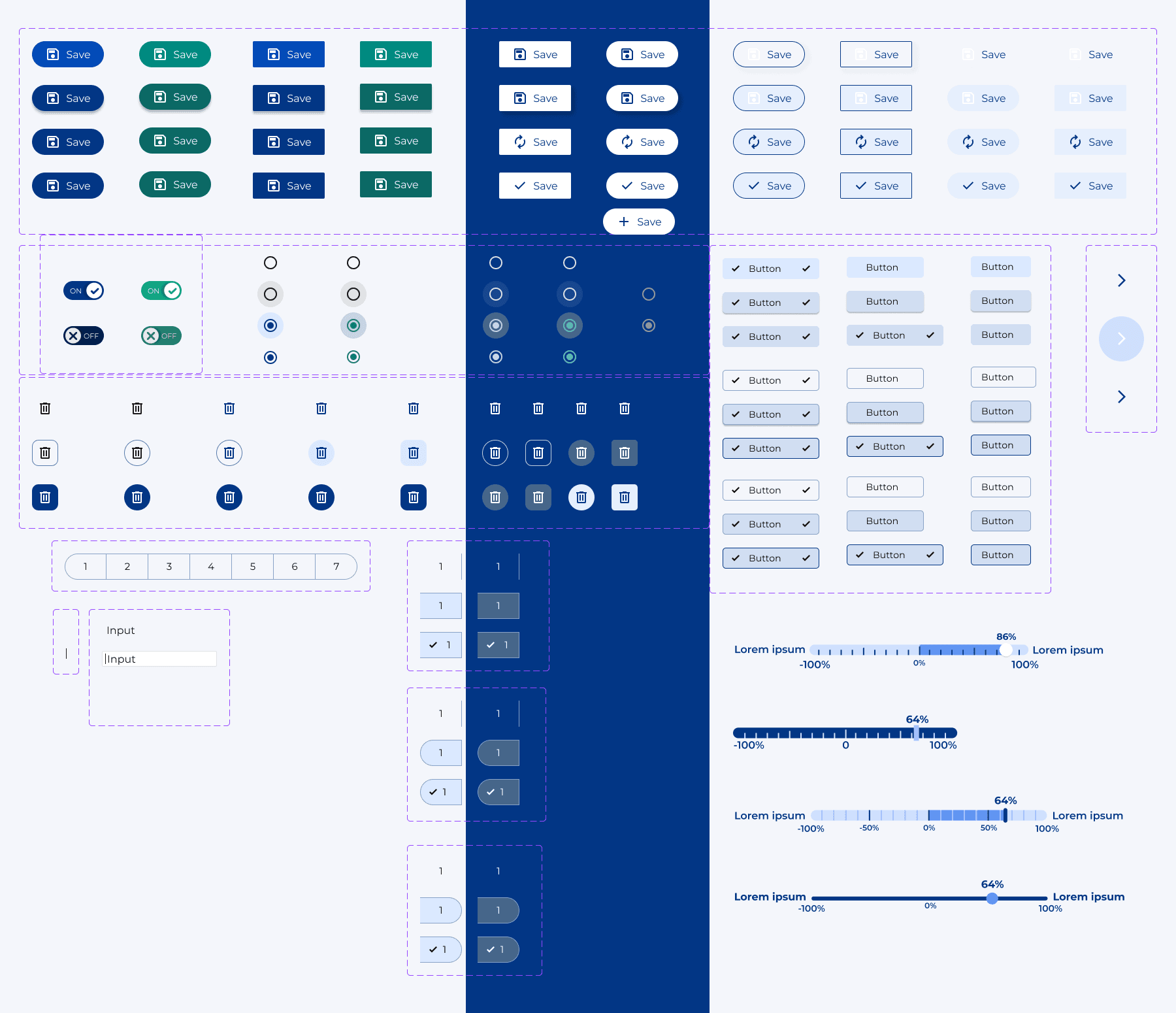
UI/UX Misc. Components
UI/UX Misc.
Components
13
13
Conclusions
Conclusions
Takeaways
Takeaways
I expedited the development of ax3 significantly for its future launch (~15%) in just 4 months!
I expedited the development of ax3 significantly for its future launch (~15%) in just 4 months!
A beta for ax3 has recently come out based on my work and the work of other interns!
A beta for ax3 has recently come out based on my work and the work of other interns!
Worked with c-suite level executives, software developers, marketers, and fellow interns, giving me experience with working in a fast-paced, collaborative environment
Worked with c-suite level executives, software developers, marketers, and fellow interns, giving me experience with working in a fast-paced, collaborative environment
My time at Manzanita K.K. was one I will never forget, from the skills I gained in a new environment, as I learned to design in a way that appeals to the common human experience to the friends and mentors I found along the way, I am extremely grateful. :)
My time at Manzanita K.K. was one I will never forget, from the skills I gained in a new environment, as I learned to design in a way that appeals to the common human experience to the friends and mentors I found along the way, I am extremely grateful. :)