Honors Website
Honors Website
I was the Graphic/Web Designer for the DePaul Honors Office, and one of my tasks was to improve their website's user experience.
The DePaul Honors program is a liberal arts curriculum at DePaul University that teaches students current topics and critical thinking skills.
I was the Graphic/Web Designer for the DePaul Honors Office, and one of my tasks was to improve their website's user experience.
The DePaul Honors program is a liberal arts curriculum at DePaul University that teaches students current topics and critical thinking skills.

Goal
Elevate the user experience of the DePaul Honors website
Goal
Elevate the user experience of the DePaul Honors website
Tool(s)
Figma, SharePoint
Tool(s)
Figma, SharePoint
Timeline
1.5 years
Timeline
1.5 years
01
01
Lo-Fi Wireframes
Lo-Fi Wireframes
As a desk worker at the Honors Office as well, I understood that a main concern for users was that they couldn't find the answers they were looking for on the site.
As a desk worker at the Honors Office as well, I understood that a main concern for users was that they couldn't find the answers they were looking for on the site.
My solutions to this problem were:
My solutions to this problem were:
Adding a navigation system at the end of each page, allowing users to navigate the site without scrolling back up to the nav bar
Adding a navigation system at the end of each page, allowing users to navigate the site without scrolling back up to the nav bar
Altering the information containers on the website to include links on words that when clicked will direct users to pages with more information on those topics
Altering the information containers on the website to include links on words that when clicked will direct users to pages with more information on those topics
Lo-Fi Wireframe of these Solutions
Lo-Fi Wireframe of these Solutions

I also experimented with changes I could make the the hero image of the site's pages to improve user experience. At that point, the hero images were photos with the title of the page at their bottom and a gradient for contrast between the image and the text.
So, I created a low-fidelity wireframe placing the page's title on a banner at the top of the page's hero image to inform the user of the page they clicked on immediately.
I stylized the banner to look like a ribbon to call back to the Honors Office's prestige.


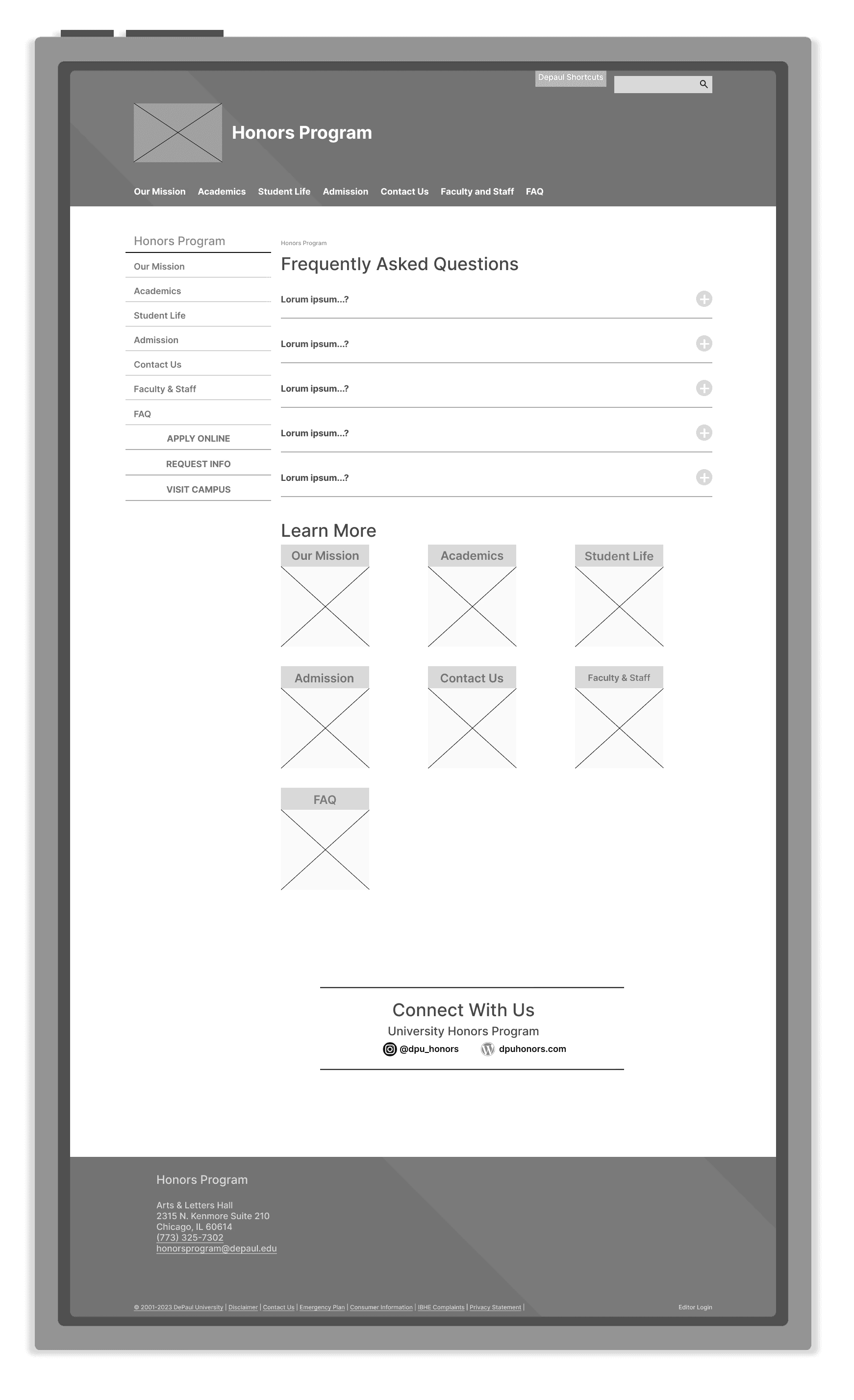
In addition, based on studying the FAQs of various DePaul websites, I designed a low-fidelity wireframe for a FAQ page for the Honors Office site.
In addition, based on studying the FAQs of various DePaul websites, I designed a low-fidelity wireframe for a FAQ page for the Honors Office site.


02
02
Stylistic Changes
Stylistic Changes
In addition, I created stylistic redesigns for the containers that exist on the DePaul Honors Website using the DePaul branding color scheme which uses the colors BLUE and RED, including my word-link concept in my designs.
In addition, I created stylistic redesigns for the containers that exist on the DePaul Honors Website using the DePaul branding color scheme which uses the colors BLUE and RED, including my word-link concept in my designs.


03
03
Implementation
Implementation
My final implementation of my designs in SharePoint using HTML & CSS!
My final implementation of my designs in SharePoint using HTML & CSS!
My accomplishments:
Designed and executed flow and navigation changes to 20 webpages, improving overall UX design
Developed a training resources library to aid in the onboarding/training of new graphic/web designers
My accomplishments:
Designed and executed flow and navigation changes to 20 webpages, improving overall UX design
Developed a training resources library to aid in the onboarding/training of new graphic/web designers


