Moore Guitars
Moore Guitars
I redesigned the website https://www.mooreguitars.com/ in my vision, for mobile and desktop, to improve its user experience and visual cohesiveness!
I redesigned the website https://www.mooreguitars.com/ in my vision, for mobile and desktop, to improve its user experience and visual cohesiveness!
Goal
Improve the user experience of the website
Goal
Improve the user experience
of the website
Tool(s)
Figma
Tool(s)
Figma
Timeline
5 weeks
Timeline
5 weeks
01
Brainstorming
Purpose of the Site
Sell guitars and musical accessories/instruments to users.
My Critiques
Appears congested and cluttered
Homepage doesn't have an immediate or clear call-to-action (CTA)
Visual hierarchy feels unbalanced - doesn't guide a user's eye
My Implementation Goals
Add more spacing and hierarchical organization to the site
Place a CTA on the homepage that users can interact with intuitively
Highlight the products being sold through design strategies that guide the users' eyes to them
Also: give the website a distinct and memorable personality!
02
02
Lo-Fi Prototype
Lo-Fi Prototype
First, with the goal of making a low-fidelity prototype for my redesign, I brainstormed concrete changes for the site to address my critiques.
First, with the goal of making a low-fidelity prototype for my redesign, I brainstormed concrete changes for the site to address my critiques.
My Critique
Critique
What I Changed
Changes
Appears congested and cluttered
Appears congested and cluttered
Reduced number of pages listed in nav bar and added spacing between all elements
Reduced number of pages listed in nav bar and added spacing between all elements
Homepage doesn't have an immediate and clear call-to-action (CTA)
Hero image doesn't
have clear interactive elements
Added CTA button to hero image to direct user
Added CTA button to hero image to direct user
Visual hierarchy feels unbalanced
- doesn't guide a user's eye
Visual hierarchy feels unbalanced
- doesn't guide a user's eye
Made the products being sold the focus of each page, particularly the homepage where I put them in a carousel
Made the products being sold the focus of each page, particularly the homepage where I put them in a carousel
Desktop
Desktop
Mobile
Mobile
03
03
Personality
Personality
The original site's color scheme was focused on greys and a forest green, with yellow as a highlight color, giving it a more rustic vibe.
In the spirit of the assignment, I reinvented the site's personality entirely. I came up with two distinct style tiles depicting new aesthetics for the site based on external research of other popular sites and design styles I admire.
Style Tile #1
Style Tyle #1
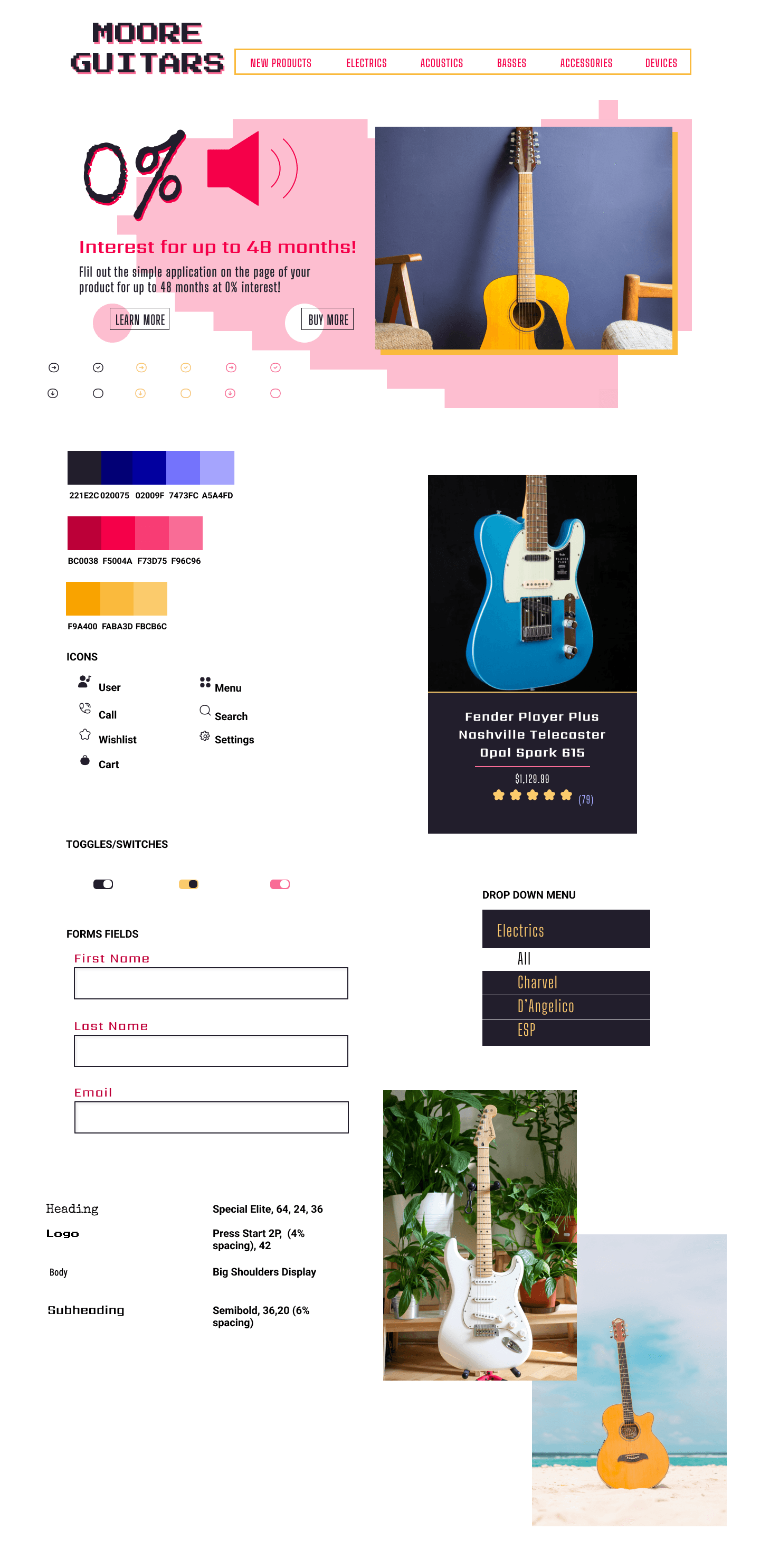
A fun, summer vibe ~ imagine a person on the beach strumming their guitar!
A fun, summer vibe ~ imagine a person on the beach strumming their guitar!
Style Tile #2
Style Tile #2
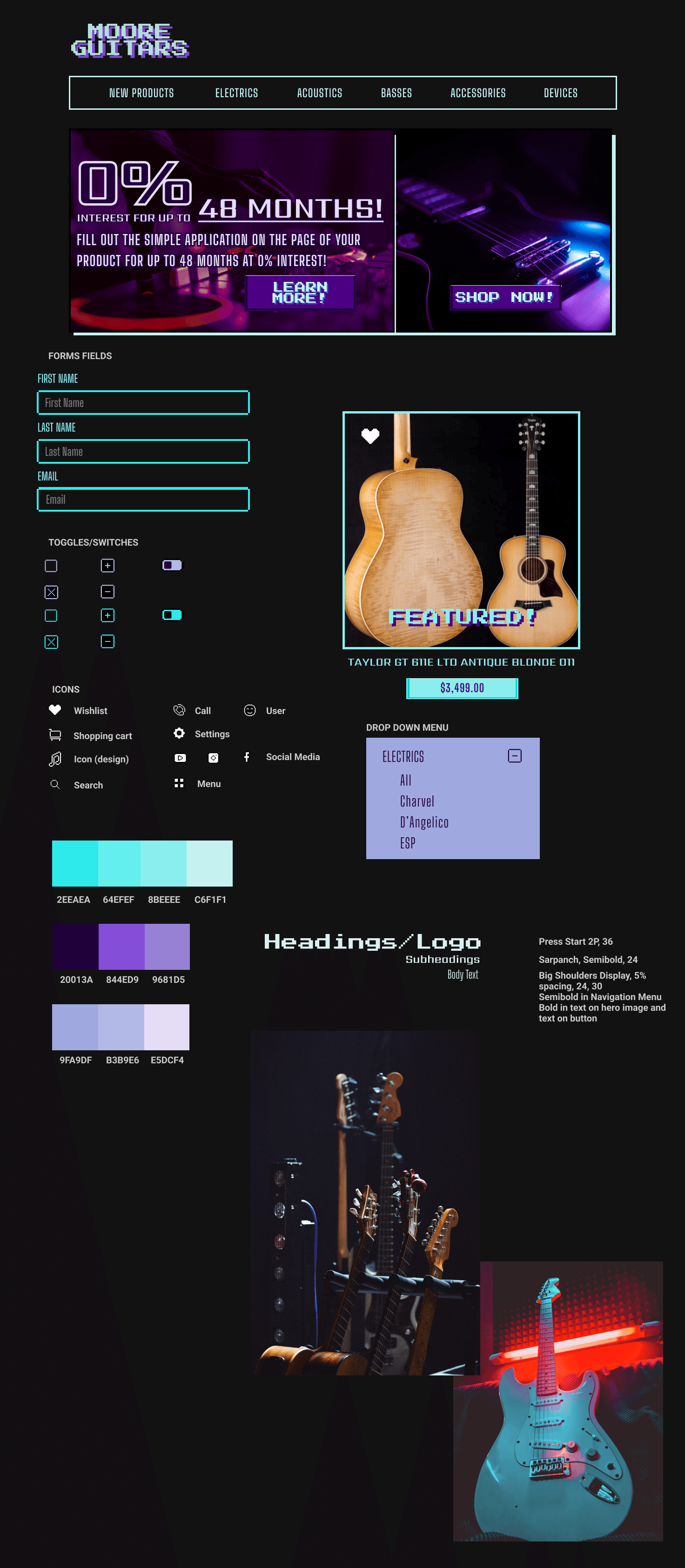
A retro angle based on my love for old school arcades and electronic music!
A retro angle based on my love for old school arcades and electronic music!
I conducted an A/B test comparing the style tiles with a user base of students from my university. The results divulged that more than 50% preferred Style Tile #1.
Many asserted that they preferred Style Tile #1 because it suited a fun music site better, and that they would be more likely to buy from a site with that aesthetic.
04
04
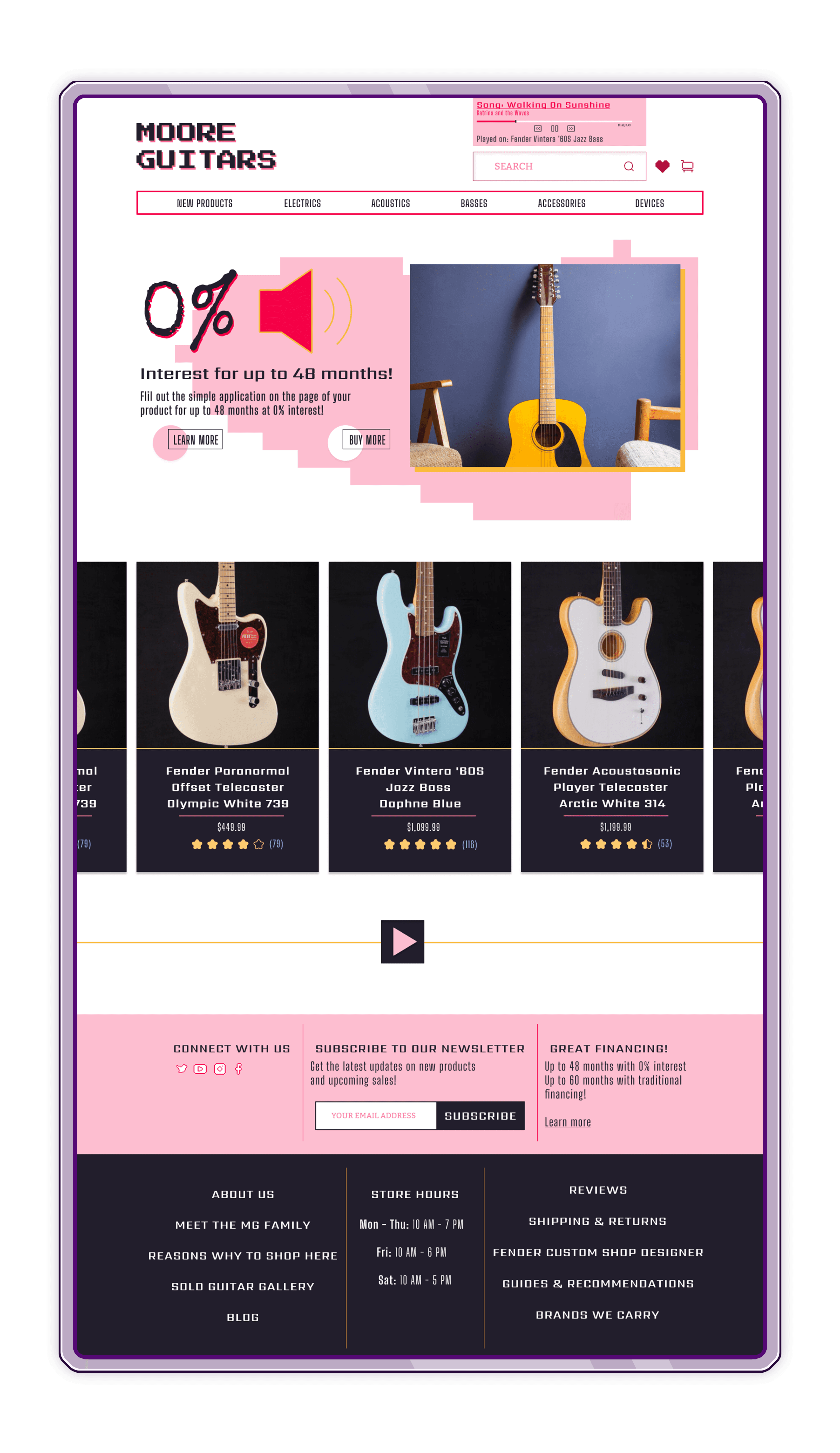
Final High-Fidelity Product
Final High-Fidelity Product
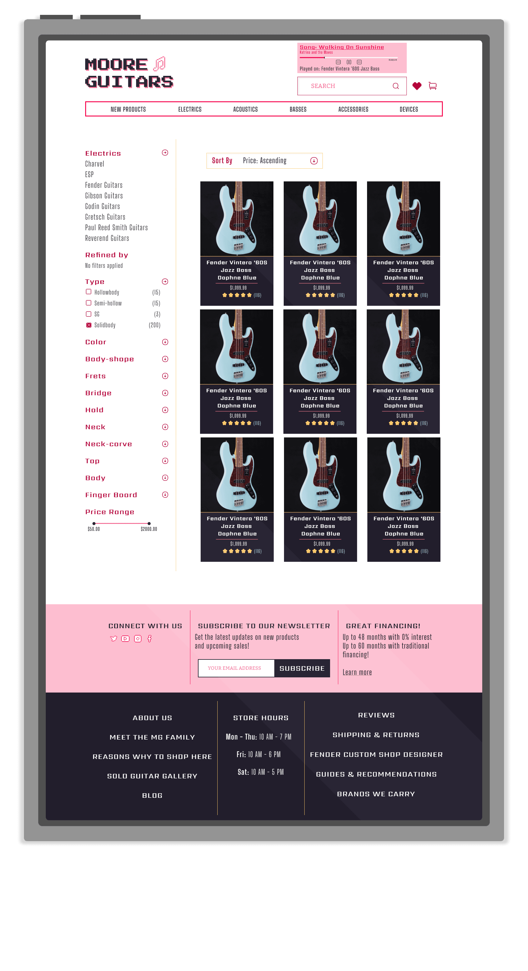
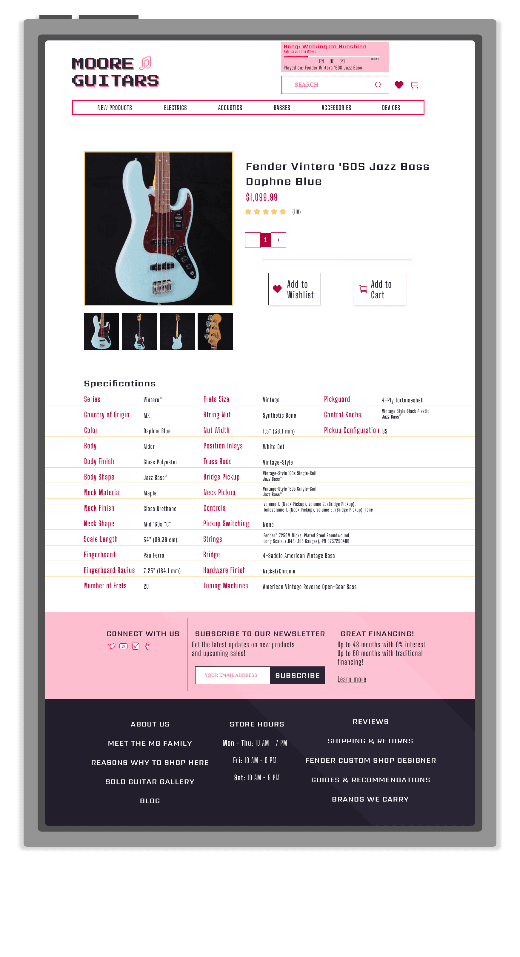
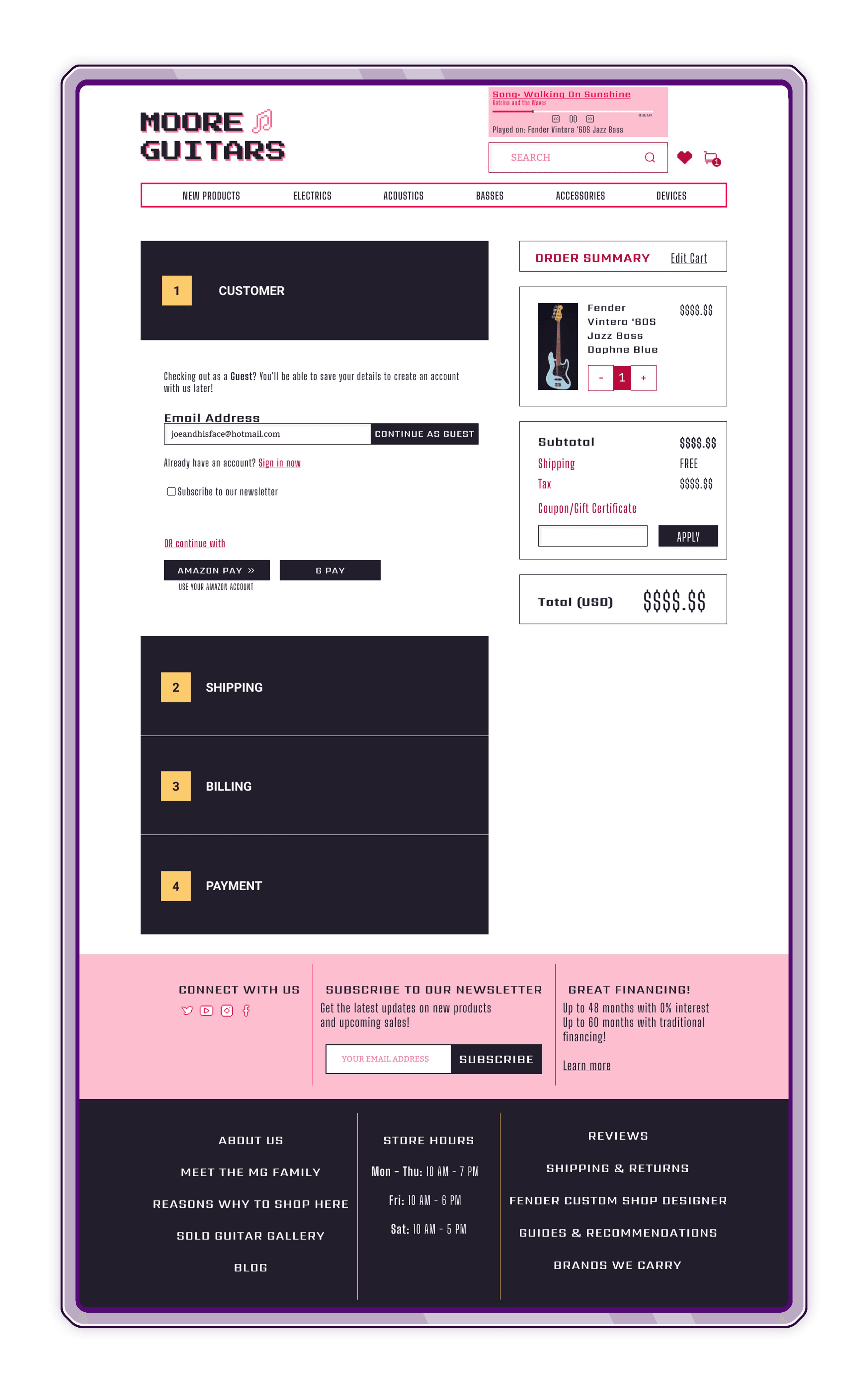
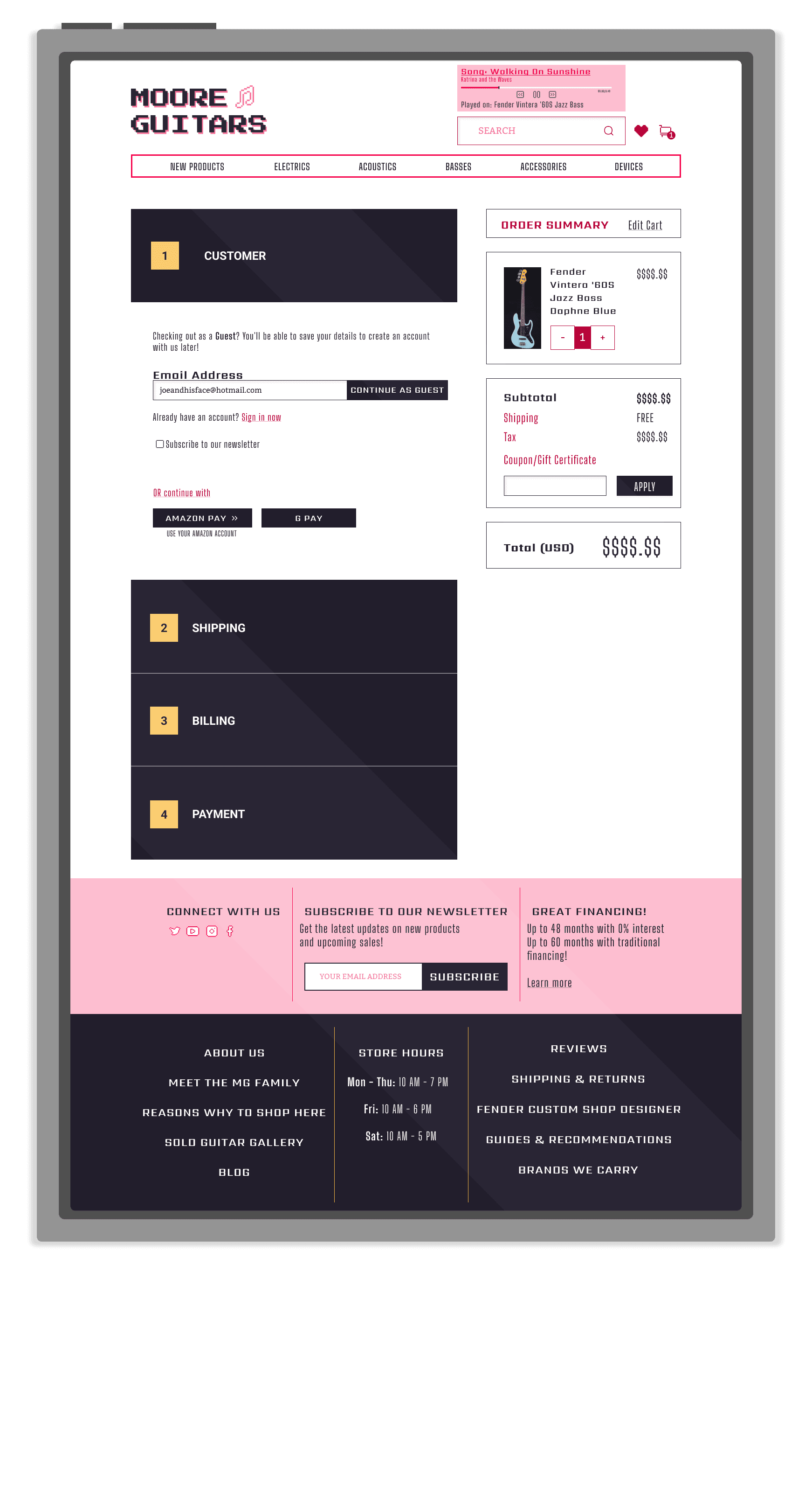
These are my final redesigns, including 5 high-fidelity wireframes for mobile and desktop respectively.
In addition, I added, to the top right of the site a music player - this player would automatically play a song being played by an instrument being sold at the store.
The goal of this addition was to add to the fun, summer energy of the site and give users an idea of what the instruments at the store sound like since they may be ordering solely online.
Desktop
Desktop
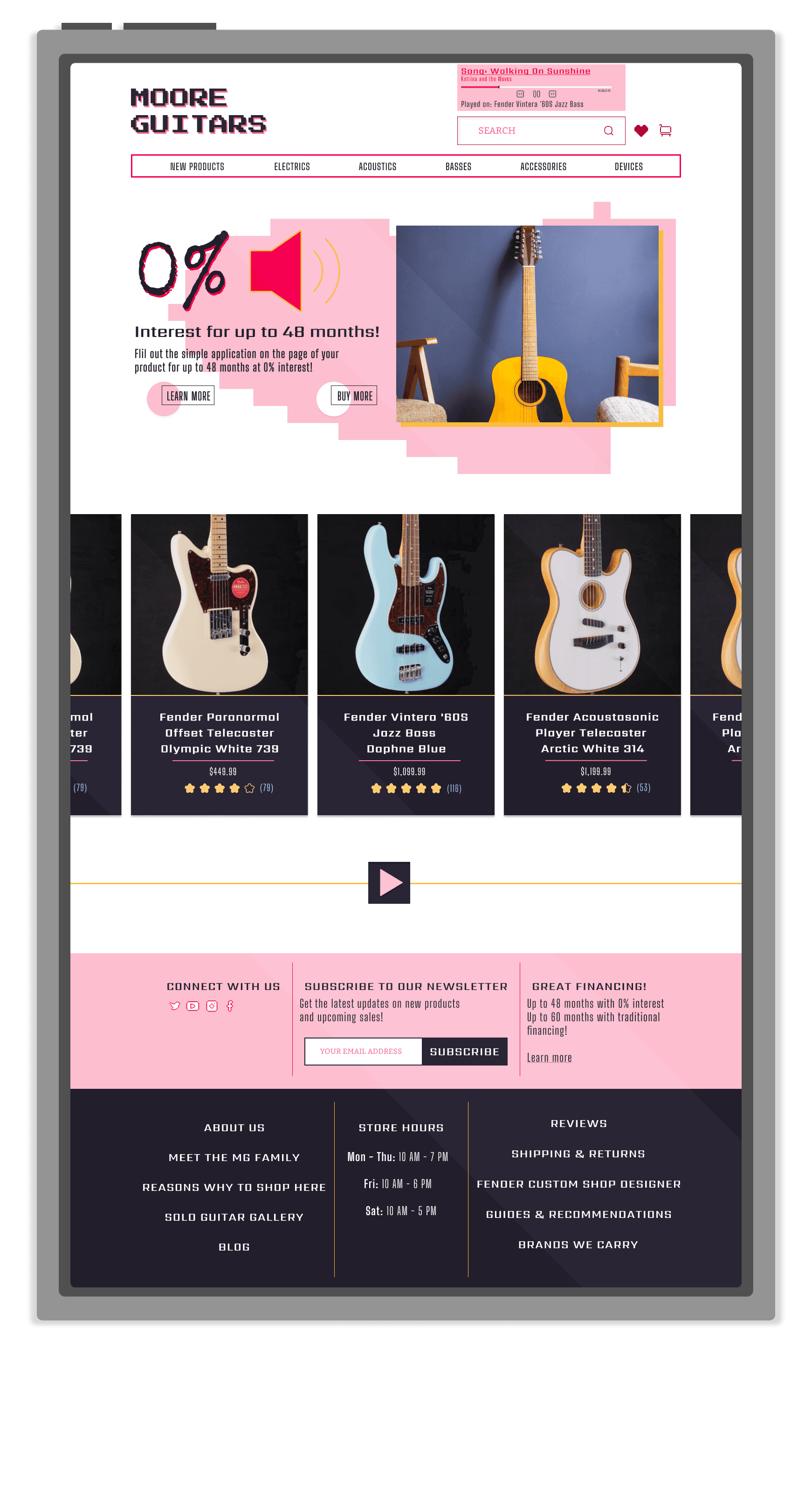


Mobile
Mobile